
Finally, Fascinating Day Four...
Another day allotted to wildlife - we had references for three of the Big Five, elephants, a close up head of a lioness and of a buffalo - once again we couldn't keep up with Hazel's fully packed schedule for the day, so sadly didn't get to the buffalo.

My unfinished lioness - waiting patiently for me to get back to her - some day...

My garishly overworked first attempt at elephants using different palette combinations
 My pale imitation of Hazel's painting (see below)
Hazel stressed again the importance of tone over colour, saying one could paint an elephant with any combination of transparent yellow, red and blue - no opaque pigments, as layers of colour are built up to produce the the tonal range.
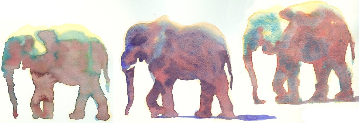
 To show this, she painted three versions of an elephant using three different palettes... the first using yellow ochre (semi-opaque, so used only in very thin washes), ultramarine and alizarin crimson - the second using Indian yellow, prussian blue and alizarin crimson and the third - as an experiment - raw umber, transparent turquoise and quinacridone red. With the size of the
  elephant again determined by the size of the brush she started each one with the palest yellow wash to form the shape, leaving white highlights where the sun struck their backs, then the second wash, paying attention always to tone, then the third dropped into the shadows. To make the dark tones, she mixed a purple/violet with all three colours, in a drier mixture to add definition.
My first elephants were a bit of a sorry affair, so with the next demonstration I tried to follow her method more closely - and ended up with a pale imitation, but all in the pursuit of new skills.
 I've assembled a series of her steps showing how gently and subtley she builds up washes, each elephant different, concentrating on tone, not colour the whole way through. The front ellies more defined than the back and their feet fading as the dust is kicked up and obscures them. Using the background to bring out the foreground, she mixed stronger greens from the same three colours for the foliage, mixing wet in wet with hard edges to vary it, softening it towards the ground where it's dusty. Reminding us constantly to see "shapes not lines". The demo was photographed in the mirror angled above her workspace.
  Here, the right way round, Hazel's finished elephant painting.
  For the last demonstration of the day, and of the workshop, Hazel brought out a sheet of the Khadi paper that she loves for brighter, bolder wildlife painting - ideal for the lioness' head full of texture and deep colour. This, she says, is no longer a shape, but a block that you have to work within. The interest is in the features. Once they are carefully placed (in pencil) she works within each feature - each one a separate element. Starting with an ear, yellow ochre with burnt sienna dropped into the wet wash, then Winsor violet into the darks, painting with water to bring back whites and letting it flow and settle... "It's not an ear, it's watercolour!" Dropping in sepia to get jet darks, allowing the paint to spread into the dampened outline to look like soft fur.. where she didn't want the paint to spread so far, she used drier paint on the brush. Colours mixed on the paper rather than on the palette. For the eyes to have soft edges, she wet around their shapes and outlined them with sepia, adding yellow ochre and burnt sienna to the middle of the eye so that it 'punched out' the sepia, leaving the all important white spot of eye light.
A few final words on Hazel - her dedication to painting and to her priorities are striking and palpable. When I asked if I may blog the workshop, I naively suggested that it may encourage a few more people to register for future workshops, and she told me - very gently - that actually, she has offers from all around the world to hold them in the most wonderful and tantalising places all the time, and she turns most of them down because, first, she wanted to spend time with her son while he was growing up, and because she wants to paint. When we were discussing the internet and Facebook, and she heard of what could be done to promote her name and work on there, she didn't think long before she replied: but it would take so much time away that could be spent painting. Though I 'know' this is what is necessary in theory, it was quite startling to hear that someone would forego travel opportunities like that, to work on her art and passion. Which makes me very grateful indeed that she was persuaded to squeeze this workshop into her busy life and that I squeezed onto it!
Have you nominated your favourite watercolour books on Katherine Tyrell's survey Which are the best art books about watercolour painting? yet? My newly signed copy of 'What shall I paint' will be suggested there soon, as well as one or two others, just got to find a couple more minutes this week!


 After lunch we were faced with the challenge of a closer up figure, with strong highlights. This one really reminded me of my days as a renderer in the ad industry, and I trusted myself a bit more to do it the way I would have with Magic Markers, rather than nervously follow step by step, and actually they are very similiar methods! Leave the highlights white, in with light tone of burnt sienna, carefully forming the shapes in the face, drop in darks of a mixture of burnt sienna and Winsor violet, then the blue shadow value of the shirt, leaving the edges of the glass and the coke can white. Leave highlights crisp, soften and blend in the shadows - add the stripes in a 'pure' colour, in this case, Hookers Green. Add details into glasses, cans, chair (I should have put more colour into his sunglasses) and wash in the background, carefully leaving the highlighted contour of head and shirt. Voila! This is mine - one I was relatively happy with!


 I finally pulled out my stash of beautiful watercolour paper that I've been collecting and hoarding for years, waiting for the time that I could paint well enough to warrant using it, for this workshop and Lo!.. it actually helps one to paint better! Watercolour does what one is hoping it will do a lot more often on lovely paper. My reed painting though, was a total failure - partly because my reference photo was front, not back lit, but my wet-in-wet didn't work, my dry brush didn't scumble, not even the Arches could save it. Ah well.


