Monday, November 2, 2020

Jacaranda Time Again...


I'm glad I got at least one little sketch of them in, as over the weekend, after a week of scorching heat, we had tumultuous storms of wind, rain and hail that stripped many of the blossoms off their stalks. Hopefully more will bud, I haven't had my fill yet of the purple glory time!


 ...and the end of Inktober. I didn't much like following the prompts, but sometimes they led to revelations and discoveries - below are some of the drawings I did enjoy: 

Thinking of/feeling the word to form the shape of the action, like Throw, top left - I think this was a stick I dipped in coffee and swirled around, then dropped ink into the wet marks and finished off with some descriptive lines. The next one, Coral, almost made itself - the natural movement of ink marks on a wet or damp surface formed coral-like textures - and a fun, quick Chef, after a carefully illustrated one was rejected.


The bottom three were more personal - Float - from a photo of my daughter, though it doesn't look like her - water and its distortions are always interesting, as are Shoes, especially well-used battered old takkies - and Hide - my little 3 year old granddaughter's idea of how to do it...(smiley face with hearts emoticon here)

I'm trying to figure out what it is I really love to do, as time runs away at an ever faster rate and I don't want to waste any doing stuff I don't love any more, so Inktober was good for that at least. Some days were diamonds, and some days were stones! 

Wednesday, October 7, 2020

Inktober 2020!

Where has this year gone?...into a blur of world-changing, life-changing upheavals and restrictions, time to paint, draw, crochet, bake, read and think, and think too much. But it's October, INKtober again. It's become a marker of time, slightly annoying (so much work!) but a serious threat of FOMO if I don't once again haul out the inks, pens and brushes and just do this thing. 


I really needed to find a way to make it enjoyable, engrossing, surprising - otherwise it's just a slog and takes up too much time. Last year I found that some tiny freestyle ink-and-coffee doodles I did, and developed into images (kind of like seeing pictures in clouds) led to unexpected happy results, far preferable to my more laboured responses to the prompts. So this year I'm doing it slightly more intentionally, thinking vaguely of what I want the blobs and splashes to form but trying not to control them too much... until sometimes I do😒

Above are the first six days, following the prompts. Left to right are Fish, Wisp, Bulk, Radio, Blade and Rodent. Some of the coffee and ink splashy beginnings below, the top two with Throw and Fancy in mind, the bottom two just random, hoping they'll become something...


I really love the interactions of coffee and water and ink, thinking I should just leave some of these as they are, but that seems like a cop out! 

Tuesday, September 15, 2020

Watercolour monotypes

A first attempt at printing monotypes from watercolour painted on yupo. Years ago Rhonda Carpenter, incredibly kindly, sent me a sample of yupo to try, when I couldn't find it here in Johannesburg - I eventually found and bought a pack and am finally experimenting! I like the slippery quality of watercolours on this surface, and the clear bright tones you can get, but wanted to try monotypes, so sacrificed the original paintings on the left of each set. 


My first painting, of random objects on my studio windowsill, was very fast, loose and drippy - impatient to get a print made. I didn't dampen the watercolour paper enough to get a good print from the original, but like what was left behind on the yupo .


The second painting was more detailed and careful - starting to enjoy making compositions from these little objets! Quite unpredictable results in the print... the line I drew around the seedpod came out much darker than I'd planned. I'd wet the paper for longer but still didn't pick up as much paint as I'd hoped (the 'doctored' cellphone pic is deceptive!) 


The third attempt was more successful - soaked the watercolour paper for longer - and the print was almost darker in parts than the original.

If you want to try - paint your image onto clean grease-free yupo with watercolour. Make sure it has plenty of pigment to water ratio. While it's drying, soak some smooth watercolour paper - I used hot press 300 gsm - in water for about 10 minutes. Blot with a clean towel or paper towel to remove excess water and place over the image. Rub well all over the paper with the back of a spoon, or other smooth object (I used a pot of handcream with rounded edges), remove and hopefully there will be a monotype... I haven't perfected the process and probably won't without a proper press, but quite excited at the results!


Sunday, July 5, 2020

Round and Round the Garden


I got so behind posting paintings done on the 30x30DirectWatercolor challenge, I'm just dumping a whole bunch here, otherwise I'll never catch up! 
One or two intersected with other online challenges - Virginia Hein's Usktalk about applying explosive colour before painting just enough of the image to make it recognisable (the chairs) and international sketch-a-chicken week (irresistible!) and Suhita Shirodkar's 'Start with What If...' (What if I looked through a glass of water)


These aren't all of them, just some on the home and garden theme, which is of course the most available subject while under lockdown - I didn't manage 30, but was happy to have kept up quite a steady pace. I felt like I was getting a grip on how to get started, and use more expressive, less fussy brushstrokes as I went along. (The first ones are at the bottom, more-or-less more recent ones towards the top.) July is International Watercolour Month, apparently, so I think I must carry on while I'm on a roll - trying to curb my natural tendency to switch to something different just as I feel I'm making progress!

Wednesday, June 3, 2020

Studio Window

Oh no, they're changing Blogger - have to learn more new stuff!... it looks like I can't change the size of the images any more, unless there's something I've missed..? (I reverted to the old style to make these bigger this time.)
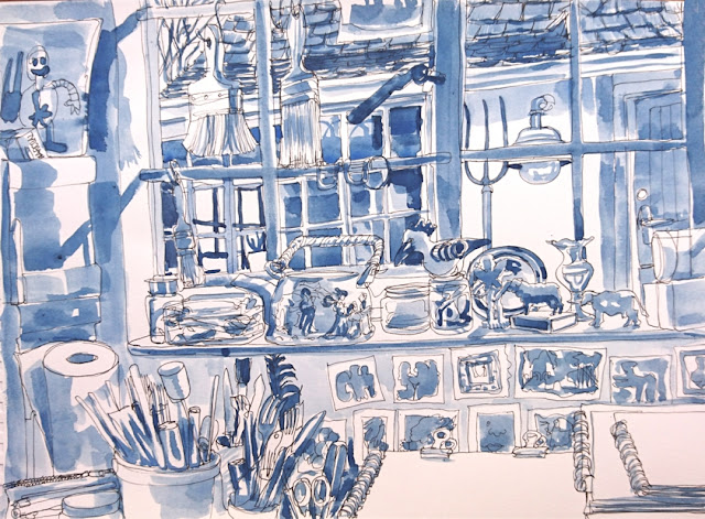
Anyway, with days blending into each other, I'd forgotten to do the weekly post I'd promised myself I would. This little series below started with a doodly sort of continuous line drawing of my studio windowsill . I then added monochromatic tones, which scattered the image into little pieces - so I printed out a copy of the original line drawing (luckily photographed it first - a good way to try out different approaches) and tried to mass the tones into bigger areas. Still a bit busy, but it's a very busy window! And then added white highlights with a Pentel paint pen. The light was changing constantly as I painted, so these do sort of reflect the passage of time in a day, but I'd love to get simpler, stronger designs in my work.


Wednesday, May 13, 2020

Garden Art


Back to watercolours - I always come back sooner or later, but the rustiness shows. The weather in late autumn here is so gorgeous, it's a pleasure to rip myself away from screens and nibbling stuff (must remember this) and spend time in the garden. Which is quite shockingly neglected as far as grooming and maintenance go, though pretty - I like all the leaves lying around and overgrowth. I painted the birdbath outside my studio and noticed that the wall is precariously leaning in towards our side, pushed over by a rampant banana/strelitzia tree next door. As soon as people are allowed back to work we'll have to sort that out...hope it will wait!


Every year around this time Joburg Land Art enthusiasts have an event and exhibition at Emmarentia Dam, which is closed off now for Covid-19. This year we were invited to make our own land art at home and post it online. I attempted an Andy Goldsworthy sort of hanging sculpture made of the seed pods which already adorn the Yellow Bells tree in our garden, extending them down to the ground by joining them together - with no man-made aids. I loved doing that and watching them swing in the breeze, until they began to drop off as fast as I tried to put them up again. So I turned to some fallen flowers and leaves - fig leaves fished out of the pool - and made a much quicker, easier, more cooperative piece.

P.S. I've just discovered a whole bunch of comments waiting to be moderated - I didn't even know that function was turned on - my apologies for seeming to ignore your visits and responses! They included a bunch of Chinese porn site ones though, so just as well some were monitored before publishing, yikes!

Thursday, May 7, 2020

Pastel Rocks


Some more pastels produced while taking the online course on by art professor and teacher Gregory Kerr, using different methods of creating the paintings. This one of my son - about 25 years ago - and our dog Gucci who has featured elsewhere on this blog... he wasn't actually present at the rock pool, or even born at the time, but due to the wonders of photography and drawing he makes an appearance. This one was built onto a charcoal base.


And this was onto a base of a tonal ink painting, which is how I got such dark areas - difficult otherwise with the medium. This is my husband's grandmother's bridesmaid transported from Cape Town in 1910 to a Kidds Beach thicket of bush. How are those flowers!

So what do I like about pastels?

  • They are quick, you can lay down colour in seconds, layer after layer.
  • They are easy to change, almost endlessly depending on your paper. You can work and rework and add and remove over and over again.
  • There are loads of colours available, but you can get lots of effects just with a basic set.
  • They're easy to take out and put away.
  • You can get lovely veils of colour, as well as expressive marks.

What don't I like?

  • They are dusty, chalky, stick to your fingers and clothes and work surfaces. Which actually you don't even notice when you're deep in the process, but do have to clean up eventually - the whole room!
  • There seems to be a lot of waste - so much pigment just falls down the paper, and some colours get used up fast. I've been collecting it in an envelope, perhaps to use as a base for another one - waste not, want not, or just Scrooge?
  • The results I've had so far are - pastelly, I want to get some bright brights, dark darks - which is possible as I've seen in others' work but not in mine so far.
  • I tried quick sketching with them (below) and they were - ungainly, clutzy, although once I stopped trying so hard to control them (got really annoyed!) and let them do their thing, I was happier with the results - in the last drawing. 
  • They seem very fragile - you can fix them very lightly with hairspray or fixative, but a heavy coat changes the surface alarmingly. Storing and framing must be a challenge!


I've always wanted to paint this chair with the about-to-bloom cymbidium, and the light behind them - more of this subject to come I hope, if I can stick with it!  (This was a London USkTalks project to use different colour papers, and different to your usual palette)