
 Well now, Adam left such a lot of questions on his comment on my last post A Holiday to remember - that I thought I'd reply with another post about the same painting in case anyone else wants to know too. His questions are in blue...
 did you put a fine wash of transparent yellow down first that gives that wonderful warm timbre to the light?
I put a light wash of W&N Yellow Ochre down first, preserving some whites on the brightly sunlit areas - umbrella, hat, shoulder etc. When that was dry I used masking fluid to sketch in the long grasses and the small highlights on the umbrella.
i guess not being a in rush whilst out in the field 'plein-air', allows for a cooler, more deliberate & more planned approach. to lay a violet-based shadow wash over a bright, pure yellow .... (the shadow did go over the yellow stripes or visa versa? difficult to tell from a jpeg of a painting - though i can see that the greens are classic 'dark over light')
One of course has more time to plan how to go about portraying an object from a photo - which would hopefully help next time one is in a plein-air situation. On the umbrella I first put down my familiar, if predictable 'shadow' wash of ultramarine mixed with burnt sienna (which probably looks a bit violet against the yellow) and when dry added another wash of that on the underside, then added the yellow stripes afterwards.
great that you resisted the urge to fill-in the little empty 'gaps' in some of the washes such as on the back-side of the easel ...
I'm learning, slowly, when painting from photos, to leave well enough alone, to try to keep a freshness about the strokes!
Vivienne is a trooper to hold so many oil brushes in her hand & her posture is so strong & in the shoulders. very concentrated!
Think I added a few extra brushes, trying to keep my brushstrokes light and quick! I was quite careful to keep those little wrinkles around the shoulders to describe the posture.
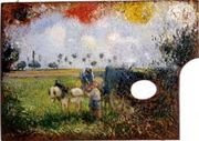
i never expected that a palette lay-out diagram could have such a funny 'insert' image (see enlarged image at top of post) posed inside the middle of it!! (do you know pissaro's pallete with the painting inside it?)
That was such a quick sketchy-sketch, also from a photo, that I did for a 'value' study, just on layout paper, and decided to stick in my journal as it did remind me so much of the time, place and people - and the middle of the palette diagram was the only space left! Is this Pissaro's painting you were thinking of? I found it here....
 but just a pedantic word here, if i may... what are the sizes of these two paintings? it's terribly difficult to have a real appreciation if one hasn't the sizes written underneath the jpeg...( you had to have one piece of negative criticism, didn't you?;)
A teacher is allowed to have a pedantic word! I know I'm very bad at recording sizes, supports and mediums - sorry sir! Vivienne painting is on Fabriano - 398mm x 250mm and the bench one is about 160mm x 105mm, stuck in my A5 - ish journal.


 Posts
Posts


